
The Mapmaking Process - Digitization and Photoshop
Part II on Mapmaking

Part I on Mapmaking: Mapmaking for Novels - Why, How, Resources
In this post:
The workflow from physical drawing to digital product
Photoshop tutorials, tricks, and tips
A breakdown of specific resources and platforms that I used
Overview
As mentioned in Part I, I began mapmaking by naming and listing out known geographic features by region. I then looked through a number of example maps for inspiration, keeping genre conventions in mind, and hand drew the initial map. Geographic features (trees, canyons, etc.) were sketched separately and turned into digital assets before I digitized the entire map using Photoshop.
Reminder: There are plenty of resources and tools outside Photoshop. This post happens to focus on Photoshop, since that’s what I used for Thervade’s map.
Given prior coverage on alternative (non-Photoshop) resources and the whys of map creation, I’ll jump straight to the production process.
Drawing the main map
Step #1 couldn’t be simpler. I drew the map in pencil and marked major points of interest. Once satisfied, I traced everything with a fine-tip marker to avoid smudges and for high contrast when scanning/photographing the finished work.
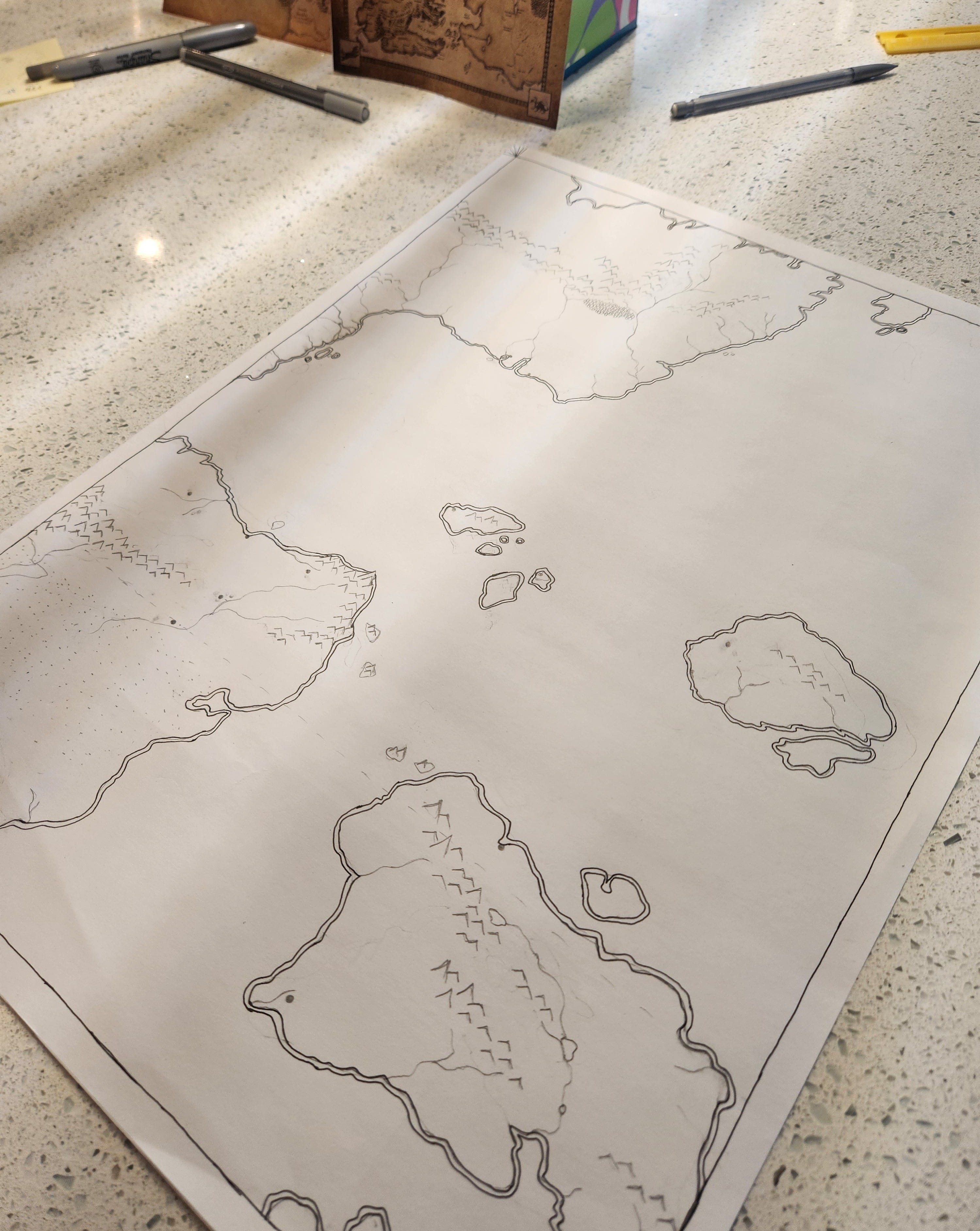
In my case, I was forced to photograph rather than scan the map. A scan would have been cleaner in terms of level positioning, but learn from my lack of foresight. I began drawing with a mere subsection of the map in mind, thinking that I would focus on the northeast quadrant relevant to An Intimacy of Bones. Then, when I instead expanded my work, I was already locked into a certain scale (final size 22x24”), even though scaling up or down would have been simpler with digital tools.
Truly, I could have taken a good note from Angeline Trevena and her lovely cartography (Exhibit A). Working at a smaller scale akin to hers would have been just fine and scaled well.
Drawing geographic features
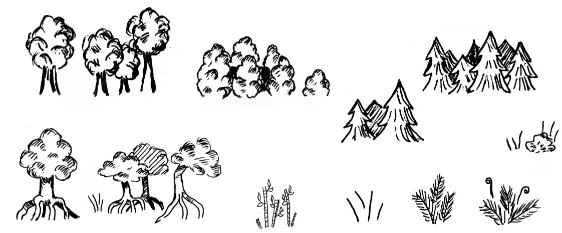
After completing the main map, I drew a series of geographic features for reuse across the entire expanse. “Simple, bold lines” became the rule, as more intricate sketches scaled down poorly, which I found especially (and sadly!) true for trees. At first, I was determined to differentiate tree types for added nuance (mangrove trees vs. evergreens vs. palm trees), but I learned my mistake when digitizing such assets. Frankly and despite my ambitions, a certain level of detail wasn’t visually friendly when applied to an entire, high-level world map. In the case of tree types (plus reeds, bamboo, and more), minor details interfered with the map’s primary purpose: communicating key locations.
If certain details don’t amplify viewer comprehension, cut them.
Digitizing the map and geography
With all features drawn, I photographed and imported the image files into Photoshop. Again, you can use other programs. For anyone familiar with Photoshop though, it’s an easy task to use “select color range” or other selection tools to delete the white background from a drawing, leaving only black lines. Those lines can then sit atop a transparent background for placement in a print-ready file (Part I covers why transparency is useful), or you can swap the underlying layers for any preferred aesthetic, like a white background or aged parchment.
Note: If you’re interested in using Photoshop, but are are unsure where to start, layers are where it’s at. Layers allow you to infinitely refine, add, subtract, or experiment with a particular project. Even if you’re using other programs, layers as a concept are pretty standard. Understanding them is the initial step to maximizing value, and Youtube has numerous tutorials.
This post isn’t meant to be a thorough tutorial on Photoshop, so I won’t dig into technical details. What’s important to understand for anyone taking this route, but with limited knowledge, is this:
Import the map image into Photoshop.
Remove the background.
Refine your line work to make the map crisp and clean, which you can do in multiple ways, ranging from very manual (painting over the lines with the brush tool) to automated (filters, the content-aware tracing tool, and/or pen tool).
If your handwriting is chicken scratch like mine is, scrub any handwritten names from the map (eraser tool) and re-add text using your preferred font. Mine was Baskerville Old Face from Photoshop’s inventory, simply because it kept visual consistency with title and heading fonts within the associated book. For a standalone print, I would branch out. Note: You can easily conform text to map lines/shapes/geography in Photoshop by using the pen tool to create a path. Tutorial link here.
Add various geographic features (after they’ve been digitized into reusable assets).
For the geographic features, I first digitized them in a separate Photoshop file, now my inventory file/sheet. I followed the same process as above for a transparent background and sharp lines, but more importantly, experimented with scaling specific assets to the actual map for determining edits. It turns out that thickening the outlines and adding heavier shadows was necessary for features to pop, which gave the map a more professional look.
In terms of adding geographic assets to the map, Photoshop again had a range of tools for more manual work (copy+paste a specific mountain layer/image multiple times) to highly automated. I recommend the automated route, which meant converting each geographic item into its own brush (basic explanation).
Note: You can also purchase cartographic Photoshop brushes. I’ve never personally done this, but Etsy and numerous other platforms offer such products, whether you’re looking for geographic features or ones more suited to D&D campaigns.
Use digital tools to polish the map
With core map features completed, final polishing was in order, and I find it’s often the last 10% of work that really elevates a piece. Fortunately, Photoshop (and other digital tools) facilitate experimentation ad nauseam, because it’s easy to play around without committing to anything. Based on my experience, I would note the following considerations.
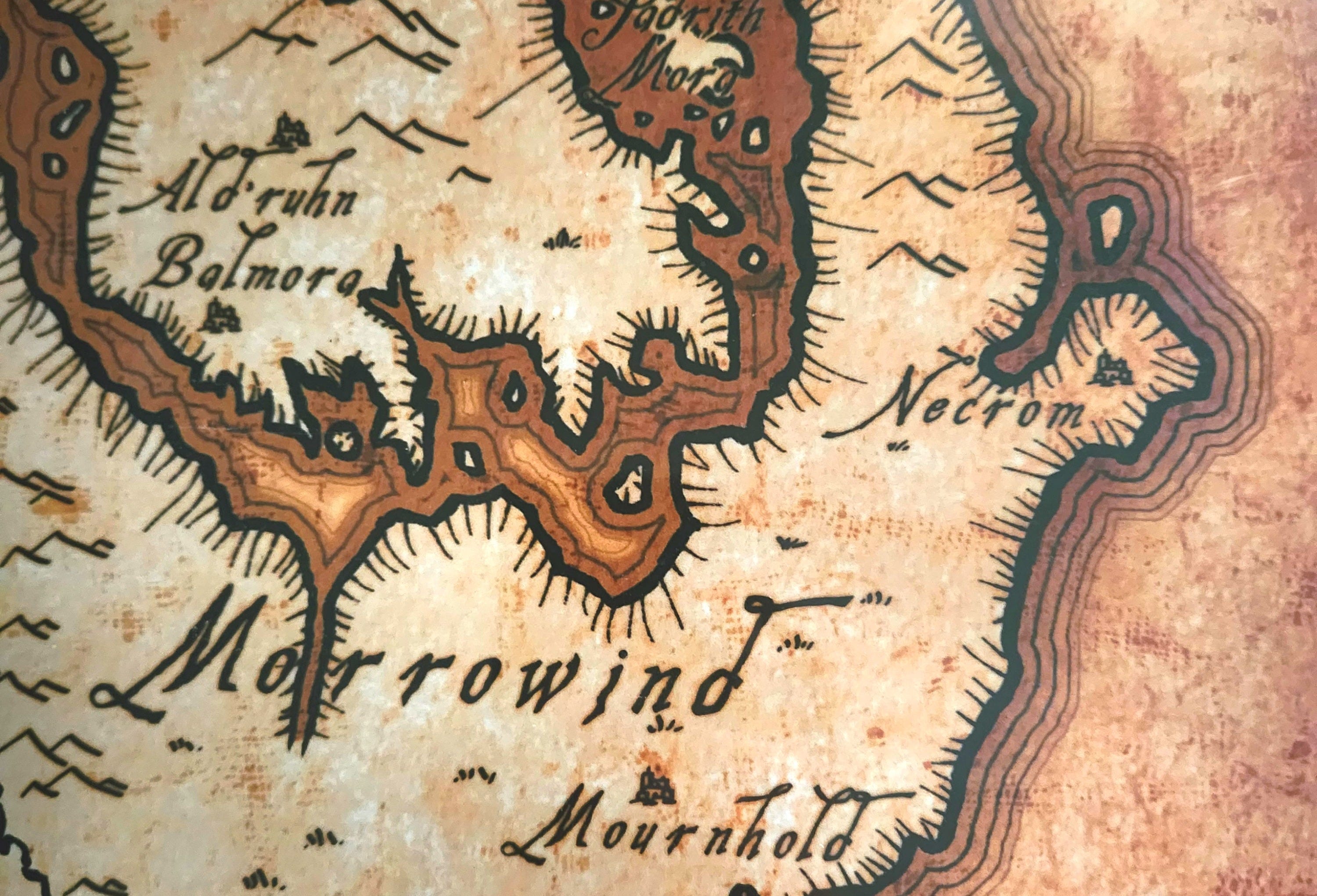
Adjust shading, line thickness, or other details to ensure that viewers can distinguish between land and water on first glance. Ex) Use a darker shade to fill in water, extend a gradient from shorelines, or use fading outlines.
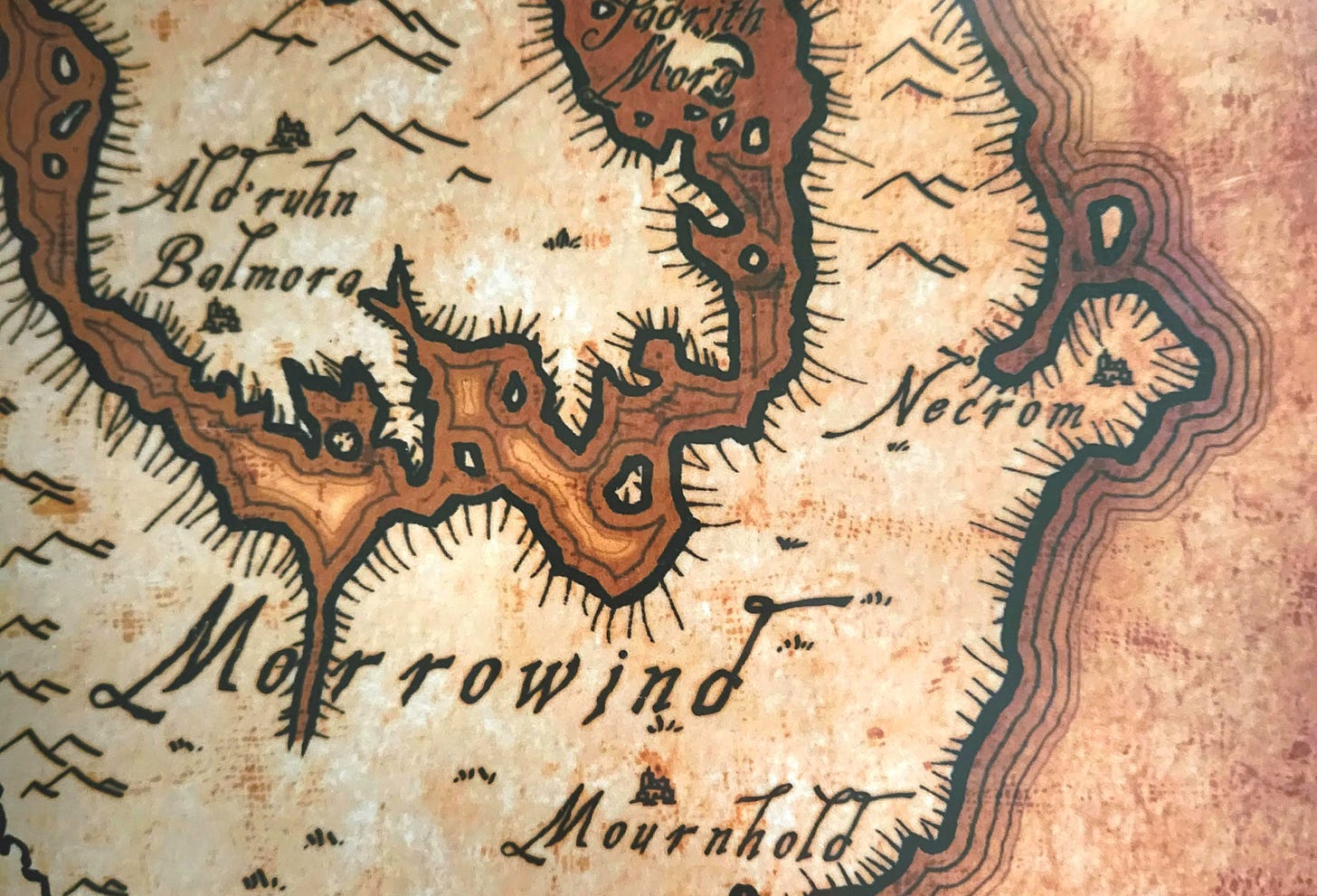
Above: I quite like this shoreline example from The Elder Scrolls series. Unfortunately, I’ve seen this map re-uploaded (including for sale) so many times that I have no idea where original attribution belongs. Change line color or color balance and add different backgrounds to create an aged or futuristic aesthetic. Futuristic wouldn’t have made sense for my map, but there are amazing sci-fi examples out there. For Thervade, I ultimately settled on aged parchment as a background, for which I purchased a stock image from Shutterstock. Could that same visual effect have been achieved with custom painting and gradients in Photoshop? Yes, but there are limited hours in the day, and we all decide where to prioritize time based on available resources and cost.
Add the final elements that you’d expect on a proper map: a compass rose, any pictorial flairs (ex. the classic sea monsters in unexplored waters), a border, or even latitude and longitude. Once those are present, you can assess the overall visual balance of the map and decide whether additional elements would complement the core.
Play around with flaws. Use a textured Photoshop brush as though the map got dirty in one corner. And, if you don’t want to manually paint each flaw, many creative communities offer dirt/crack/you-name-it brushes for free (assuming attribution, and yes, honor that) or for purchase. If you’re coming from traditional art, such shortcuts (custom brushes) might not come naturally, but it’s a perk of digital art.
Based on visual balance, add idiosyncrasies that give your map character and extend world-building beyond geography. In my case, I added a merchant’s mark. I also added a scribbled note from a scribe who owned the map at some point. This kind of work is enjoyable, but also adds depth.
In Conclusion
Mapmaking is fun, and between all the available tools out there, the world is your oyster. Also, digitize assets once, and you have them for use in future projects. The difficulty is knowing when to stop tinkering with a particular project and call it done, because, like any medium or tool, use brings expertise, which leads to seeing new applications and possibilities.
Happy mapmaking to all!